

How To Label Photography Medium for Exhibitions?

Updated: Apr 7, 2024
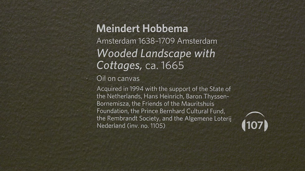
What if I told you that the label you choose for your photography can make or break your exhibition? It's true.
The label is more than just a name tag. It's a powerful tool that connects your image with your audience and tells a story that goes beyond the visual.
But how do you create a label that does justice to your photography and captures the attention of your viewers? That's what this guide is all about.
You'll learn how to label photography medium for exhibitions and discover the best practices that will make your work stand out.
Why Labeling Matters in Exhibitions
Labels in exhibitions serve a greater purpose than just naming the work. They act as a portal into the photograph's significance, allowing viewers to tap into the artist's vision and creative process.
Well-crafted labels provide crucial details that transport viewers deeper into the image. They build a narrative around the work that reveals key information on when, where, why, and how the photograph was taken.
For the photographer, labels represent their voice in the exhibition space. It's a chance to articulate concepts and share perspectives that shaped their photographic journey.
In essence, labels unlock deeper meaning that takes the viewing experience to the next level. Rather than just seeing, viewers are experiencing and engaging with the artwork on a richer level.
Key Decisions for Labeling Photographs
Acrylic Sign Holders
Acrylic sign holders offer an elegant and streamlined look, especially for modern or contemporary exhibitions. The transparency allows the photograph to take center stage while discreetly delivering the crucial label information.
However, some downsides exist. Acrylic can create an overly sterile impression that detracts from more organic photography. There is also potential for glare depending on the lighting. Prints may appear washed out behind the plastic.
Printed Labels
Traditional printed labels provide flexibility in terms of label shape, size, and visual design elements. They enable customization for specific needs.
While they lack the sleekness of acrylic, printed labels pair naturally with more traditional photograph styles. Using high-quality, archival inks and acid-free papers ensures longevity.
Tips for Choosing Between Methods
Consider label size needs. If labels must be oversized, printed labels allow more freedom.
Assess glare potential. Acrylic labels near spotlights may cause problematic reflections.
Evaluate costs. Printed labels get more economical at higher quantities.
Factor in label life expectancy. Acrylic often lasts longer than paper.
Determine aesthetics. Pick the method that best matches the style of the photographs.
Assess ease of changing. Printed labels make late content changes simpler.
Crafting Optimal Label Content
The information presented on the label provides crucial context. Follow these best practices for informative, readable exhibition labels:
Include Key Details
Artist's full name
Title of photograph
Date of image
Dimensions
Photographic process used
Edition number (if a limited edition print)
Omit Non-Essential Data
Don't clutter labels with tangential information like the photographer's birthplace or musings about inspiration. Stick to factual details directly related to the image.
Mind Character Counts
Use clear, concise language.
Avoid jargon and art theory buzzwords.
Craft digestible sentences that get right to the point.
Seek Consistent Structure
Maintain the same order of info on all labels for continuity. Such as:
Artist Name
Title
Date
Medium
Dimensions
Place this essential data first before any secondary details.
Size Matters
Use a font sized appropriately for easy readability at a glance (generally 20-point font or higher).
Allow adequate white space around text for visual separation.
Keep line length short enough for comfortable reading.
Creating Physical Labels
For professional quality, physical exhibition labels should use:
Acid-free paper - Prevents yellowing and decay over time.
Archival ink - Fades minimally for long-lasting labels.
Clean fonts - Sans serif fonts like Arial provide maximum legibility.
Appropriate scale - Text should be readable from a reasonable distance.
Concise text - Include only key details relevant to that work.
Visual consistency - Maintain cohesive font, layout, and color choices.
Affixing Physical Labels
When affixing labels directly onto photographs, take care by:
Pressing down gently at the edges when positioning
Choosing archival tape or adhesives
Attaching to framing instead of print if possible
Avoiding moisture bubbles underneath
Also, consider weight. Heavier materials like wood or acrylic may require:
Strong double-sided tape
Small screws into the frame backing
Velcro for easy detachment
Avoid tape or adhesives directly on photographs to prevent residue or tears.
Protecting Physical Labels
For label longevity:
Store prints/labels out of direct sunlight to prevent fading
Maintain cool, dry conditions with proper ventilation
Gently clean labels only when needed using archival methods
Handle labels carefully to avoid tears, scratches, or dents
With vigilant care and handling, labels and photographs can be exhibited for many years.
Generating Digital Labels
For interactive multimedia labels, utilize:
Label design software like Adobe apps
QR code generators
Digital displays like tablets, TVs, and projectors
Update content digitally instead of reprinting to save time and money.
Best Practices for Label Design
Well-designed labels enhance the exhibition experience. Follow these key principles:
Readability
Use clean, simple fonts at a readable size
High-contrast colors for easy scanning
Avoid long paragraphs or small text
Consistency
Maintain cohesive visual style throughout all labels
Organize label content in a consistent order
Branding
Align with exhibition branding for a unified look
Reinforce the brand through logos, fonts, colors
White Space
Allow breathing room around text with margins
Reduce visual clutter to highlight photography
Final Words
Here are the key takeaways from the article:
Well-designed labels enhance meaning and provide context
Choose durable, archival materials suited for long-term display
Convey only key details relevant to that photograph
Position labels unobtrusively in a consistent location
Take care affixing labels to avoid any damage
Proper labeling is more than just identification. It allows photographers to communicate the vision behind each photograph in their exhibitions. Follow these best practices, and labels will effectively showcase photography while engaging audiences.


Tried out Nano Banana 2 for generating images from text descriptions. The updated version feels more responsive and the output quality has improved noticeably. Works well across different styles from photorealistic to illustrated.
Been using Nano Banana Pro for AI image generation recently. The Pro version handles more complex prompts and delivers sharper results — still powered by Gemini under the hood. Great for concept art and style experiments without any local setup.
Been trying out Nano Banana for AI image generation lately. You just describe what you want in plain text and it generates something — built on Gemini so the quality is decent. Handles a range of styles from realistic to anime. Useful for quick concept visuals without needing to set up anything locally.
Been using Pico Image for a while now for resizing and compressing images. It runs entirely in the browser so nothing gets uploaded to a server, which I find reassuring. Background removal works pretty well too, saves me from opening heavier software for simple tasks.
Got recommended Arena King by a coworker and the strategy games on there are pretty engaging. You can sink a surprising amount of time into the kingdom-building ones. Runs well in the browser without needing to download anything.